/
/


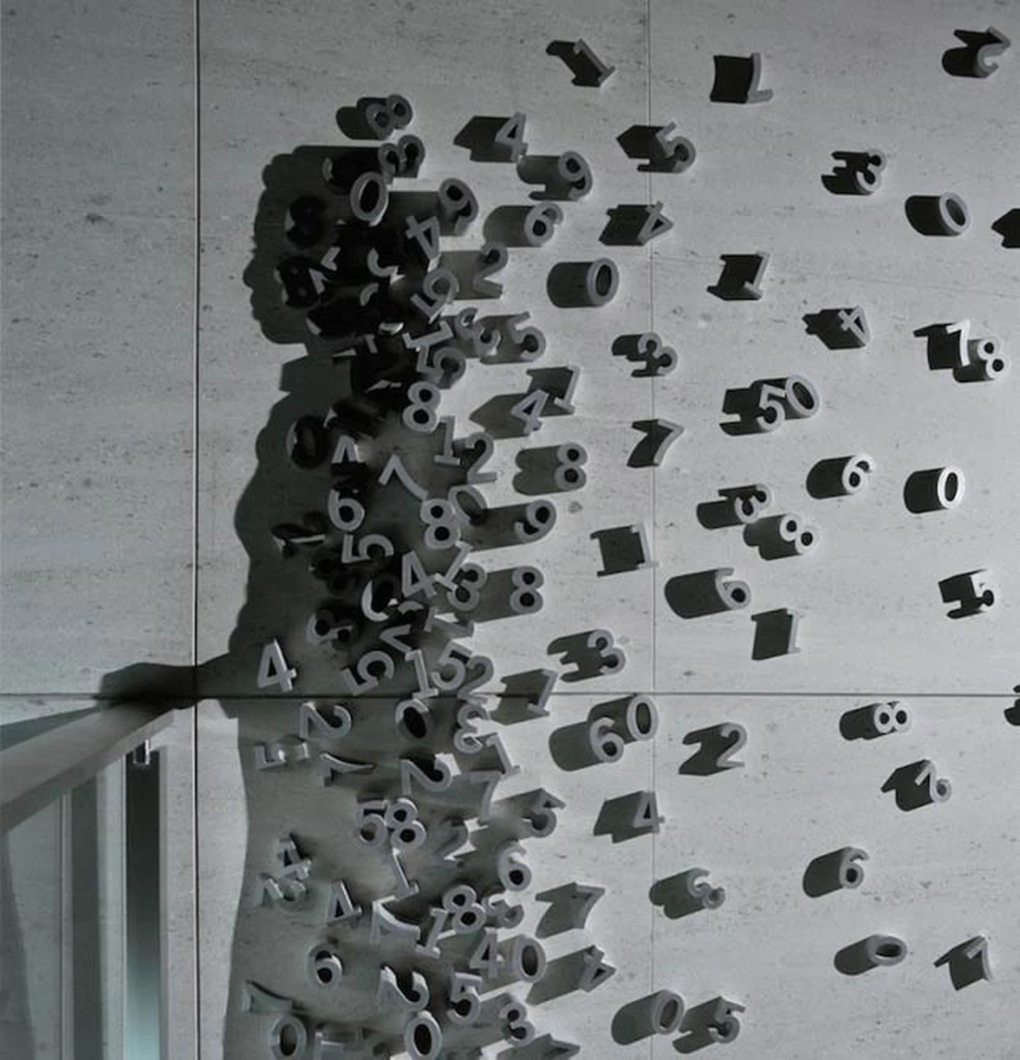
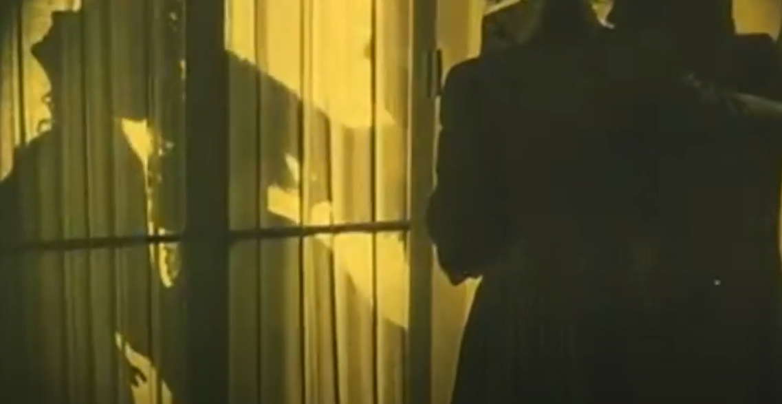
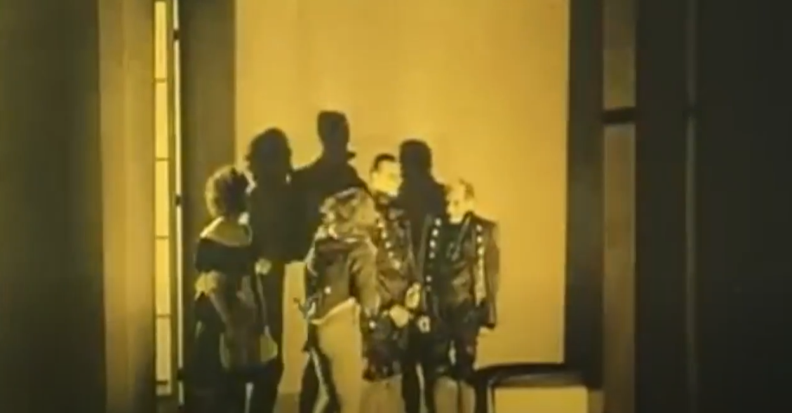
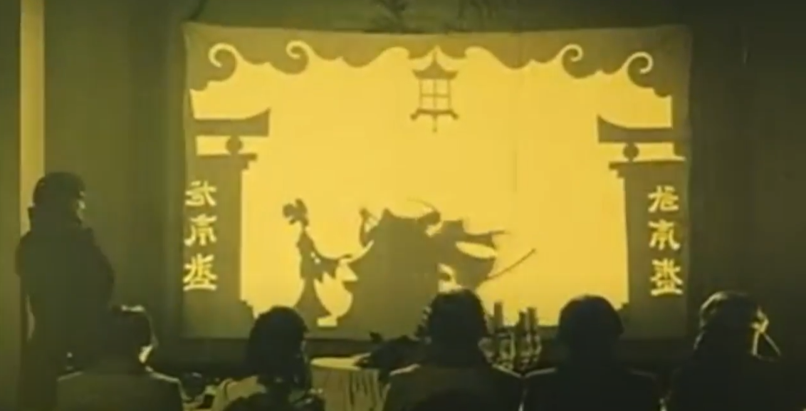
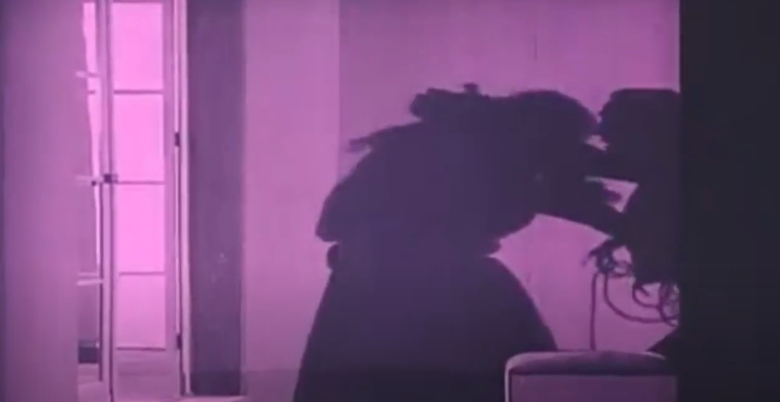
After doing contextual research of the use of shadow in designs, I came across these works that stood out. The Dracula was a clever ad campaign that made use of shadows to promote the film, while also referencing the concept of vampires, because the image (a vampire) will only appear when its night time and we know the legends state that vampires can only get out at night as they get burned by the sun. This example and the works by Kumi Yamashita showcase how shadows can be used to create images that is far different from their original object. Though as gimmicky as they are, this sparked an idea for my next step. After another feedback session, I was advised to look into "expressionism (cinema)" and I came across a movie titled "Warning Shadows". I really liked this movie, not only for its creative visuals of using the shadow as tool for storytelling, but also the meaning behind it as it critiques the nature of "truth". Shadows and reflections are portrayed as both deceivers and truth-tellers. Reality and the perception of reality dance back and forth with neither the audience nor the characters ever being completely sure what is real. This also coincides with my findings from the experiments, as shadows are often not faithful to their original object. Very inspiring indeed
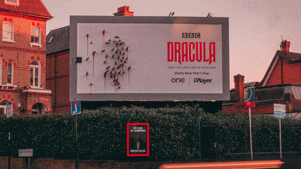
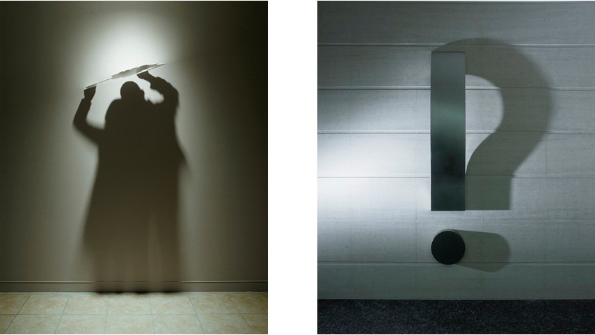
DRACULA - BBC Creative
Ad campaign that utilizes shadows in its design
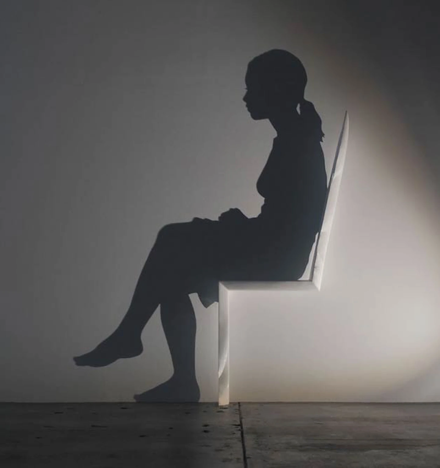
Kumi Yamashita
A Japanese artist who sculpts original, stunning art pieces using light and shadow. She constructs single or multiple objects and places them at certain distances from a single light source in order to create artwork comprised of both the solid, material objects and the shadows they make.
Schatten - Eine nächtliche Halluzination (Warning Shadows) (1923)
A German expressionist movie that utilizes the shadow in its storytelling.
Inspiration
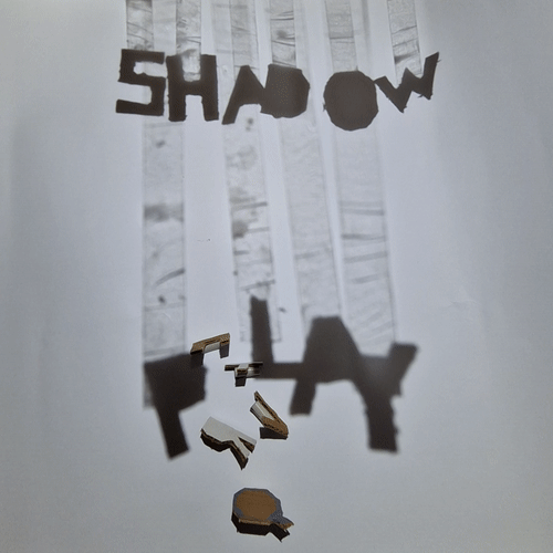
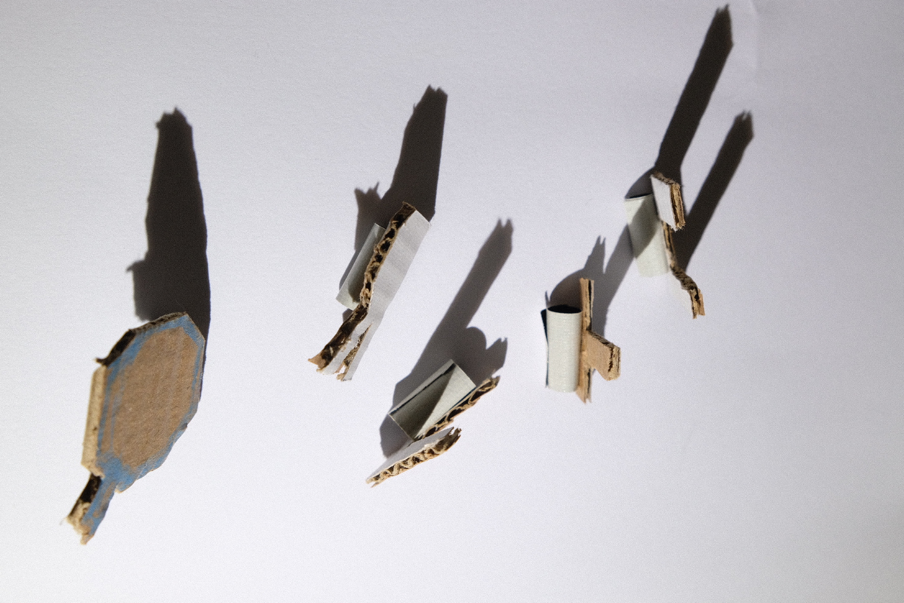
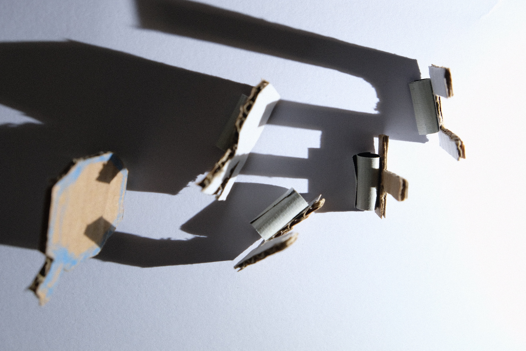
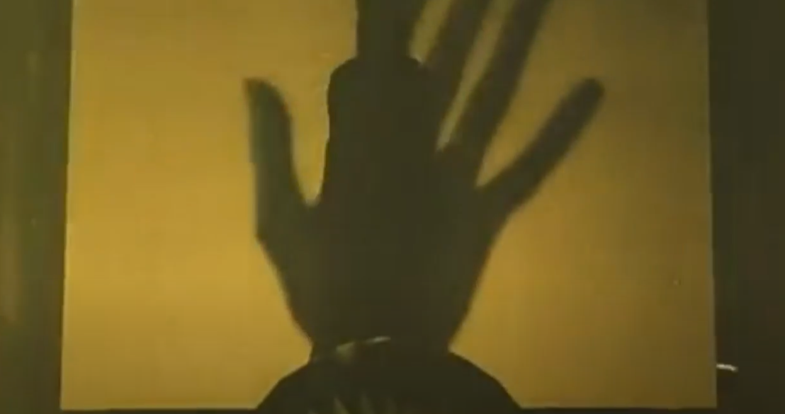
That research inspired my next phase of the project, which I titled "PLAY". The aim is to use shadow to simply play with shapes. In my previous experiments I expressed how they feel straight-forward, because I was working with obvious shapes (square objects create square shadows). Thus in this phase, the aim is to create shapes that are far different from their original object, creating new objects and perhaps provide new perspective on the characteristics of the original object. The process for this project was quite simple, as I would just play around with some letters and slowly add more and see which shadows they project.
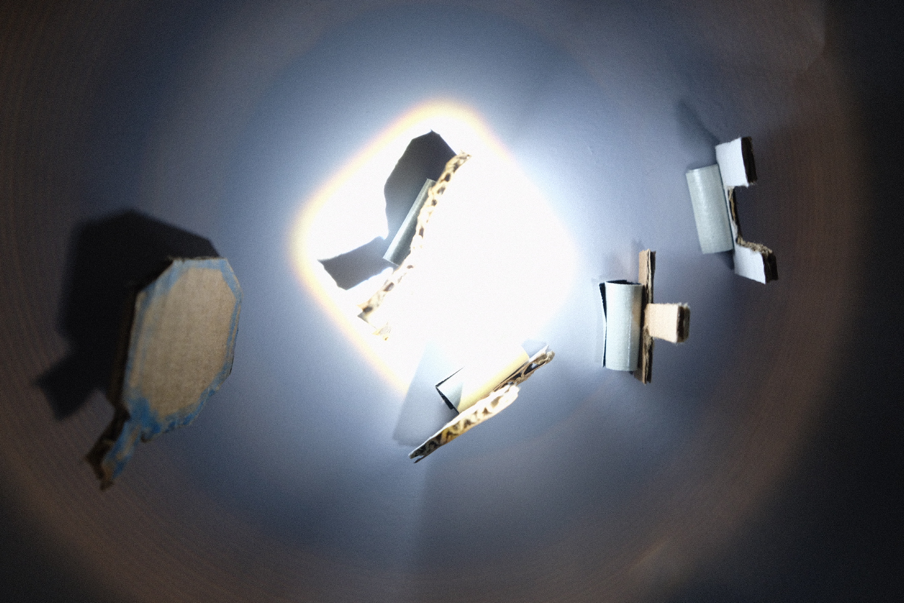
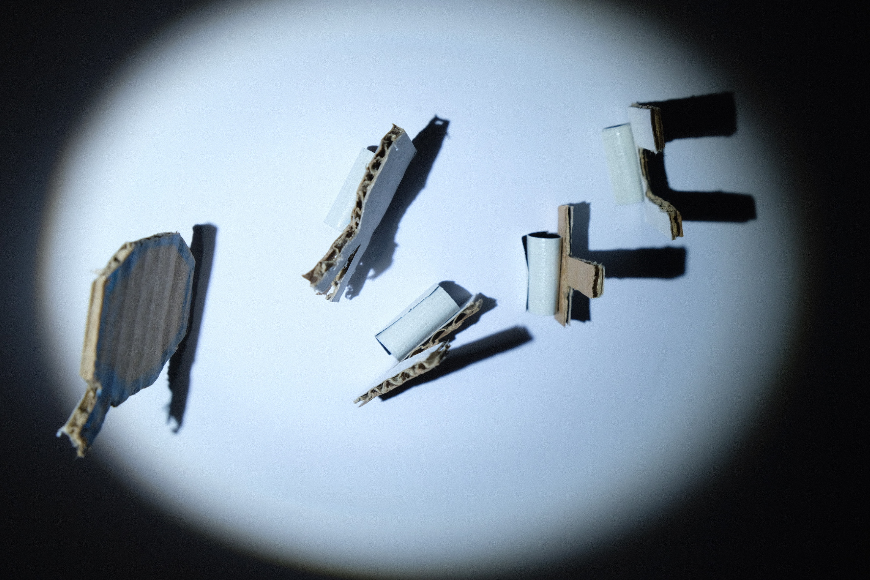
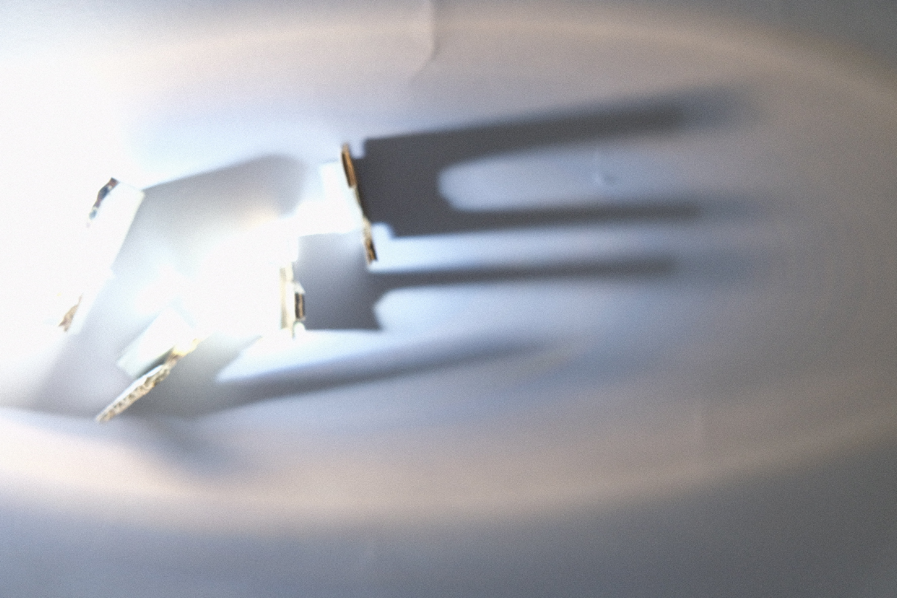
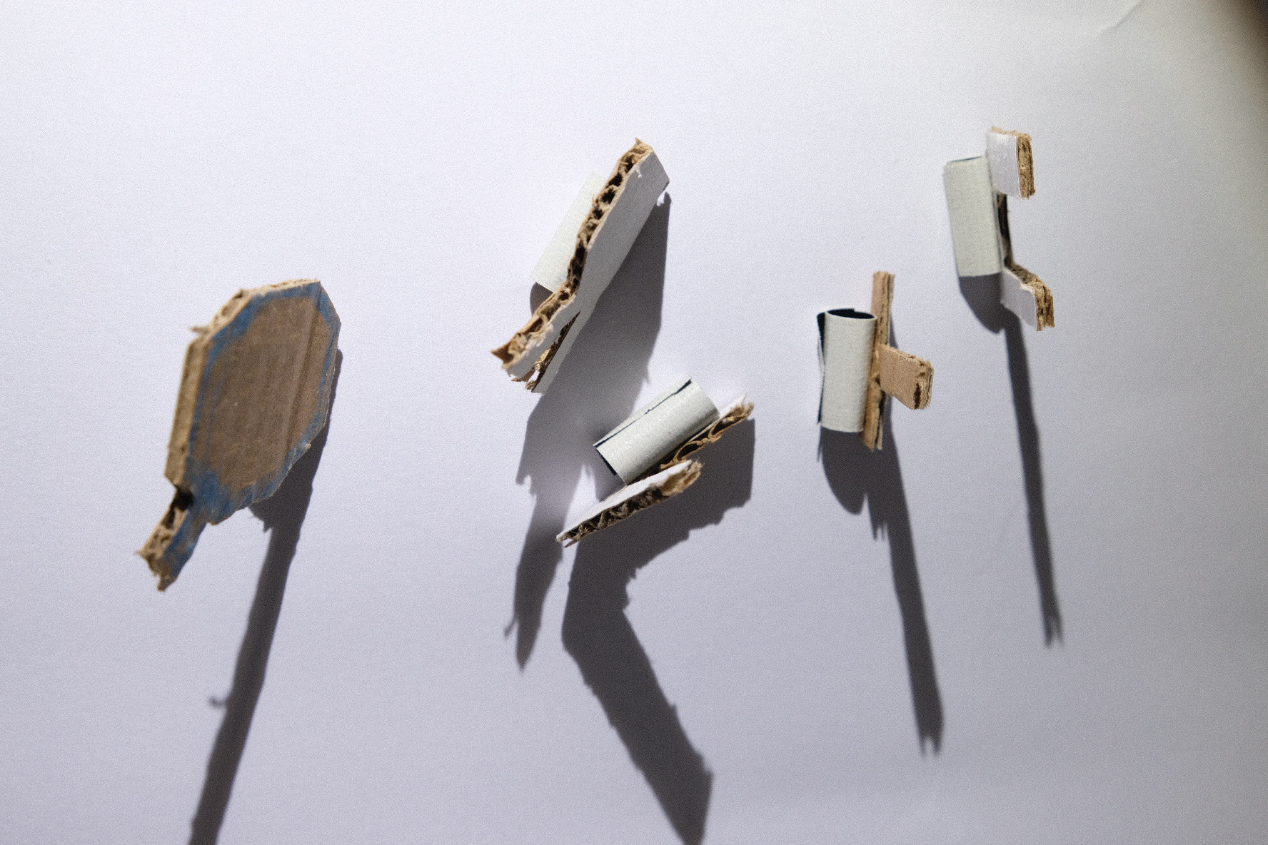
While playing around with the letters and changing their positions, I find out I could make a creepy looking hand with the letters Q, R, T, U, V. The eeriness when I tried to "animate" the hand (see gif), reminded of the expressionist cinema. I stretched the hand upwards, to make it seem like its trying to grab on something. Perhaps the shadow casted by the word "Shadow". You can say that the shapeless objects are longing to have a stiIl form, much like the shadow it's trying to grab and it can only do so by stretching their shadows upwards, forming a hand reaching ever so closer... or something like that.
I really liked the outcome of this project (PLAY), because I got to play around, combine different objects to create a whole different shadows and sometimes the results are unexpected. I want to bring this to my final presentation and let the audience also play around with shadows.
PLAY
This concluded my project for my resit. I am very pleased with the results of this project, definitely better than the failed material thinking project. Most importantly, this time around, I found a way to apply my foundings in something related to (graphic) design. This took shape in two different projects. TYPE, where I played with shadows casted by letters of the alphabet. PLAY, where I get to take objects and combine them to create shadows that cast a different image than the original object. This project allowed me to utilize shadow as medium, tool and material.