Shadow has had a long history in its involvement with art. Pliny the Elder, an ancient Roman author, told in his encyclopaedic work Naturae Historiae (competed ca. 77 CE) a story about a maid of Corinth in Ancient Greece. In an effort to preserve her lover’s image, she traced the shadow of his profile and thus the act of painting was born. While this is theorized to be a myth, it was a popular narrative and has even become a practice among Western artists from 1770s to 1820s.
Just as these artists are captivated by the idea of using shadow as means to make permanent that which is fading, I too am fascinated in utilizing the shadow in design. I believe that shadows have more potential than just to be used to trace an image. I'm interested in its ability to project an image of its object, though it might not always be loyal to its object.
That is what has inspired this project titled SHADOW PLAY.
The first challenge would of course be creating a setup. I had in mind to use school facilities for this, but I figured it would be inconvenient, due to having to book the space, setting up everytime and possibilities of others intefering. I wanted to be able to start whenever I like, on my own tempo and thus I decided to make my own setup at home (plus I like engineering make-shift setups). First I thought of a simple box, but the small size might limit my process of experimentation. That's when I thought of transforming my dining table into a dark room by removing the chairs and a lot of blankets.
A reason to use the table is the possibility to hang objects on the bottom side and of course the large space that I can fit in.
I bought a white A2 paper to use as background and some (strong) military flashlights. Of course I had to be mindful of the positioning and angles to prevent any undesirable shadows from showing (the camera stand, my head, etc.). This was really tricky and took me some time to figure out and even then I ended up with an imperfect setup, but good enough to work with.
Building a setup
I could easily do text-based research, I would like to learn through doing and experimenting. So that’s when I started with basic shapes, circle and square.
Though a simple setup of just projecting a square’s shadow, it showed well how the shadow isn’t always faithful to its object. In the pictures you can see how the shadow gets thinner while the angle of the object is changing (1a-e).
Next experiment involves a circle which is bigger than the square. I chose to use the circle, because its roundness would give a nice contrast to the sharp angles of the square. I first started by moving the objects back and forth, closer and further from the light source, which resulted in the projected shadow to vary in size (2a-f). I also noticed how the shadow, when put closer to the light source, becomes blurrier, but I wasn’t too sure due to characteristics of the object (cardboard). So, I looked around for an object with finer details and find some rope. I arranged them close to far from the light source and there was indeed a difference in sharp/blur (4a-c). I documented my findings in a drawing.
Experiment: Simple shapes
Experiment: Shadow on objects
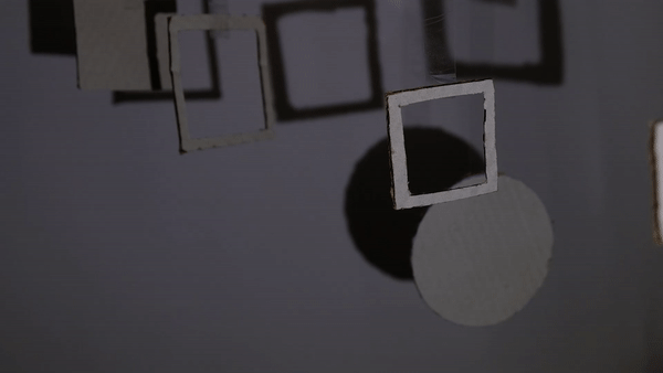
For this next experiment I’d like to experiment with casted shadow on objects. I was thinking of shapes that could best show that and I came up with hollow squares against filled square. Similar to previous experiment, the objects were first arranged from largest to smallest (1a) and then I rearranged them from smallest to largest, but I manipulated the distance so that the smallest appear large (1b-f). Immediately this caught my eye because not only was the shadows more interesting in composition, but the shadows casted on the objects shed a different light on the objects (1c-e). I then added the circle as a contrasting shape and I was drawn by how the square casted shadow on the circle (2a-c).
Lastly, I played around with light source, by changing its focus distance and noticed how the shadows have become blurrier and has gained a blue color on the contour.
With this I concluded the experiments with objects. From these experiments I learned to manipulate shadows, by changing arrangements, distance and angles. While I think the experiments are going well so far, it feels like they only gave me means to work with shadow, but I haven’t really experimented with the potential that shadows have. With these thoughts in mind, I started my next experiments using TYPE

/
/
Joseph Wright, The Corinthian Maid [1782-1784]
Joachim von Sandrart, Dibutade [1675]
Jeanne-Élisabeth Chaudet, Dibutade Coming to Visit Her Lover’s Portrait [1810]
Bartolomé Esteban Murillo, The invention of painting [ca. 1660]
Bernard Picart, Discovery of sculpture [1727]
Joseph Benoît Suvée, Invention of the Art of Drawing [1791]
1a
1b
1c
1d
1e
2a
2b
2c
2d
2e
2f
3a
3b
3c
3d
4a
4b
4c
While looking back on the pictures I took and try to reflect on my findings, I found them quite “flat” and didn’t really like how boring they look (2). However, I quite like the pictures where the object is shown with the shadow (1,4) and there was something interesting I found in some (3). The problem with (2) was that there was lack of “depth”, whole this could be seen as a unique aspect of the shadow, it didn’t look interesting in pictures. However, the pictures (3a-d) was more interesting in composition as it shows shadow – objects, but more importantly, shadow casted on object and this inspired my next step.
1a
1b
1c
1d
1e
1f
2a
2b
2c
3a
3b
3c
3d
3e
Experiment: Type
For this experiment, I used every knowledge I learned from the previous experiments, especially playing with distance. Since the word “play” is placed lower, I need to find a way to do that without having to use super long tapes, so I just moved them closer to light source and played with the angle to make them appear lower (1a-e)
In my head, it looked cooler, but it was actually quite plain. So, I decided to add some shapes from the previous experiment (2a-h). Immediately, this resulted in a much more interesting composition and again, the shadows casted on the letters gave an intriguing perspective of the letter (2f-h). Like the diagonal stripe across the “O” and the shadow on the corner of the “W”, which give these letters more personality in my opinion.
1a
1b
1c
1d
1e
2a
2b
2c
2d
2e
2f
2g
2h
Experiment: Animate
While experimenting with the shapes, I expressed how I found that I haven’t experimented enough with shadows. That’s when I decided to take it the next step and try to “animate” it.
There are of course different ways to make the shadow move: moving the object and moving the light source. I find it easier to animate the shadow by moving the light source, because with the resources I have at that moment I can’t figure a way to make the objects move in a specific way. I tried of course by flicking the object, but they end up moving sporadically and very random.
So, I just started messing around with the light and try to make the shadows move in certain directions (up and down, right to left).
I was quite surprised and pleased by my foundings as I was able to move the shadows quite smoothely, that it reminded me of animation effects that you could do on after effects (2, 3).
To achieve this, you can't simply move the object from right to left. You have to slightly curve it. I made a drawing to showcase this.
1
2
3
Next I tried looking around the place for some objects, that could possibly project interesting shadows and found a green bottle and iridescent paper (from Scrap)
Besides the interesting forms and colors it projected, it was also able to cast a second shadow (see 5 top right).
This concluded my experimental phase. I was able to learn to manipulate shadows by changing its distance, arrangement and angle. This knowledge provided me the tools to take it a step further and introduce "movement" to the shadows.
After a feedback session, I was given the advice to do research in artists/designers who have used shadows in their work to give a clearer “shape” to my project and perhaps give it a “final product”. Which I totally agreed with, because I honestly could experiment endlessly. Thus, the next two pages (TYPE and PLAY) will show how I was able to apply the knowledge I learned from the experiments and relate it to (graphic) design.
4
5
Karen Knorr, The Pencil of Nature [1994]